
Inclusive North.
Inclusive North.
Brand strategy, name development, logo design, visual identity system, business card artwork, presentation concepts
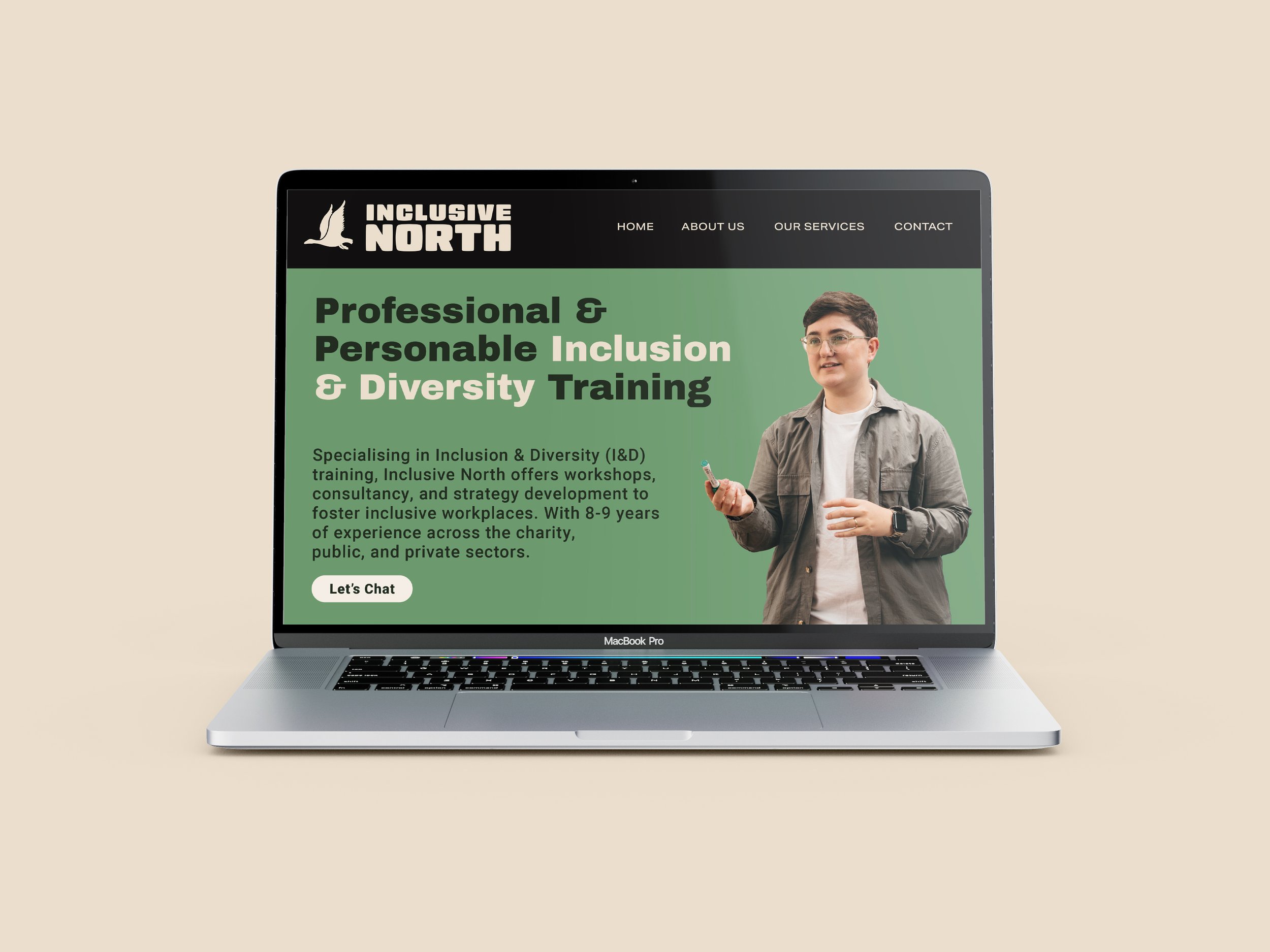
The Client is an Inclusion & Diversity consultant, public speaker, and trainer with nearly a decade of experience spanning the charity, public, and private sectors. Their work focuses on helping organisations build inclusive, supportive, and effective workplace cultures through tailored I&D strategies, workshops, and training.
Having operated in-house and as a consultant for over 28 organisations - from small charities to global companies - the Client’s strength lies in a deep understanding of what inclusion actually looks like in practice, delivered with authenticity and a human touch. They are known for their honesty, relatability, and engaging public speaking style.
To reflect their personal approach and expertise, the Client wanted a brand that positioned them not just as a consultant, but as a trusted voice in the I&D world.
The Client

The goal was to build a clear, confident brand identity for the Client’s consultancy - one that could grow with them as their work expands into keynote speaking, training, and award recognition.
The branding needed to:
Use the Client’s approachability, understanding and personality as a central strength
Communicate professionalism and approachability in equal measure
Translate seamlessly across applications: website, social media, PowerPoint decks, business cards
Establish a strong northern identity to reflect the Client’s roots and differentiate from London-based competitors
Be visually flexible to allow for future growth and adaptation
Ultimately, the brand needed to help the Client become a go-to name in Inclusion & Diversity, particularly for HR professionals and organisations across the North of the UK.
the brief


the approach
We began by honing in on what makes the Client different - the lived experience, the sector-spanning expertise, and the deeply human, jargon-free way they engage with clients.
From this foundation, we shaped the brand around three key ideas:
Guidance - Positioning the Client as a trusted, directional force in I&D
Growth - A dynamic brand that could evolve with their business
Belonging - A visual and verbal tone that feels welcoming, warm, and safe
We developed the name Inclusive North to reflect the Client’s regional base and strong sense of direction - a metaphorical ‘true north’ that organisations can follow to embed real inclusion. The name gives clarity and confidence, and speaks directly to the values at the heart of the business.
The visual concept drew on the idea of a “learning journey,” inspired by both the personal and collective paths organisations take in creating inclusive spaces - rooted in authenticity and continuous progress.